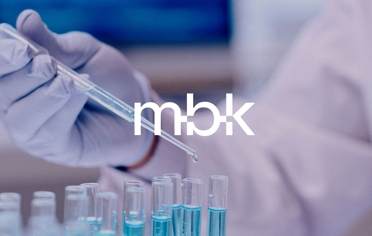

Mibiokey is a modern platform that centralizes physical and digital components, enabling the collection of biospecimens and clinical data.
It is made available to researchers and thus contributes to the creation of new diagnostic tools and future treatments.
Our mission: to design an identity capable of conveying this vision, based on the symbolism of the key and the construction of the name: MI (belonging), BIO (the biobank), and KEY (the key, the solution). This threefold interpretation guided our thinking and structured our creative approach.
The logo emphasizes this idea of connection and interconnectedness: a graphic interplay between the “I” and the “O” evokes the gesture of a key being inserted into a lock, a symbol of access, openness, and solutions.
The visual identity is structured around a strong logo (Mibiokey), a condensed version (MBK), and a symbol. All three convey the same idea of coherence and connection between the elements.
The color palette combines deep, saturated blues, evoking health, research, and digital data, with a warm orange to convey energy and humanity.
Mibiokey's new branding places the key to success and data collection at the heart of its new platform.
Mibiokey
Client
Centre de recherche du CHUM
Services
Visual identity, Production


.png)


.png)